
When we first launched WPBay, Stefan and I spent most of our energy on the foundation: solid code, fair review rules, seller protections, buyer guarantees. The site design? Honestly, we are not designers but programmers, so it was not the best out there, to say at least… it just had to work. It did what it needed to do: sellers could list their plugins and themes, buyers could search, pay, and download. But as the community grew, the old look stopped matching the quality of what we were building behind the scenes.
The more people joined WPBay, the clearer it became that the experience we offered needed to feel as trustworthy as the code powering it. A smart layout and clean design aren’t extras, they’re part of showing people that details matter here. If we expect sellers to polish their work, our own front end has to stand for the same promise. So we decided to do what we always tell our community: go back, improve, and rebuild!
Why We Knew It Was Time
Sellers kept telling us they wanted better ways to showcase their work. Buyers asked for smoother navigation and more trust signals when browsing products. And every time Stefan and I looked at the site, we knew it could be clearer, faster, and more welcoming.
We realized the only way forward was to give WPBay the redesign it deserved, not just a quick facelift, but a rethink of how the whole experience should feel for everyone using it day in and day out.
Getting the Right Team Together
At first, we thought about outsourcing the whole thing. But we knew that for this to really work, it had to come from inside, from people who understood how WPBay breathes, what the sellers need, and what buyers expect. That’s when the best designer for this job came in: Blue.
Blue didn’t just throw trendy ideas at us. He took the time to ask the right questions about how people actually use WPBay. He mapped out the flow, challenged weak spots, and turned all our scattered ideas into a clear, sharp design system in Figma. Working with Blue made the redesign feel less like decoration and more like building a real product, piece by piece, purpose first.
From Figma to Real Code
Once we had the designs in Figma, the hard part began. It’s easy to fall in love with clean mockups on a screen. It’s a different game to turn them into a living site that works on every browser, every screen size, every device, and still loads fast.
So Stefan and I got to work. We broke the site into pieces: headers, footers, seller blocks, product cards, search flow, dashboards. We cleaned out old code, rewrote our CSS from the ground up, dropped half-baked code that slowed us down. We tested every section, tweaked breakpoints, rebuilt forms, and made sure every piece felt light, clear, and simple to use.
Some things that looked great in Figma just didn’t feel right in the browser. So we scrapped them, rebuilt them, or adjusted until they fit. The goal wasn’t to match pixels perfectly, the goal was to match the intention behind them. We wanted WPBay to feel reliable, modern, and easy to trust.
Mobile responsiveness was also a top priority, as a top example of what changed is that instead of product grids, on mobile screens we added product sliders, so they take up less space in the small mobile window. Many more other improvements were also made, check WPBay on mobile also, and check it side by side with the desktop version.
What Changed and Why It Matters
A big redesign like this changes more than just how things look. It shifts how people feel when they land here for the first time. Now, sellers can feel proud of the storefront they’re putting their work in. Buyers can browse without friction, compare products more easily, and trust they’re getting quality. It’s the same mission, only clearer, smoother, better presented.
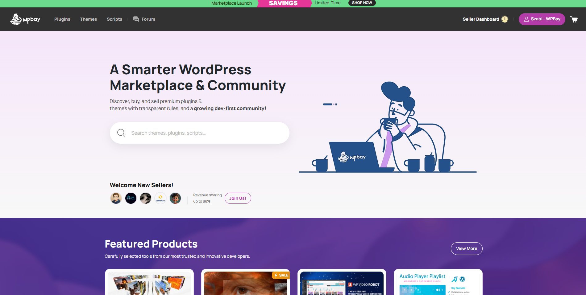
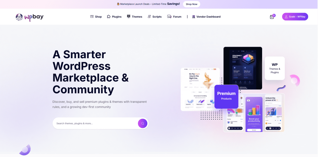
This is what the new WPBay looks like today:
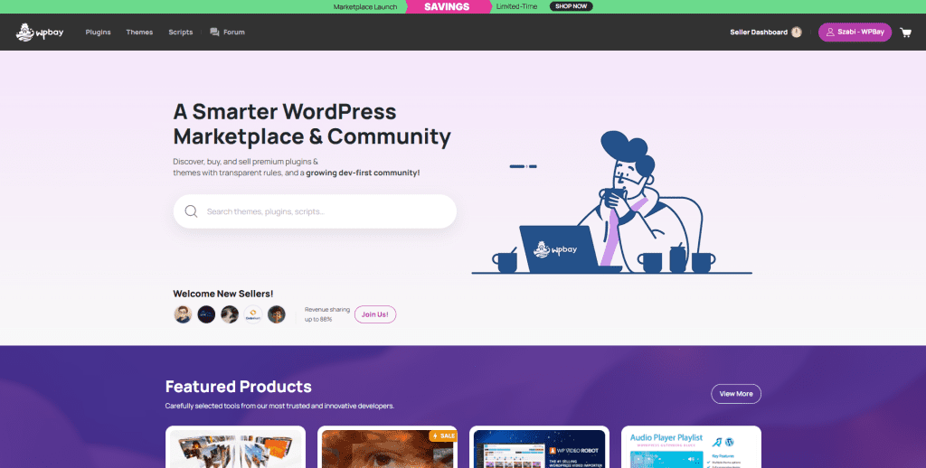
And just for perspective, this is how WPBay looked before we tore it down and rebuilt it from the ground up, a reminder of how far we’ve come, and why it was worth the effort:
What We Learned (And What Comes Next)
Redesigning WPBay showed me again that design is not some extra coat of paint, it’s a core piece of how people trust your work. A clean site is like clean code: you don’t always see the details, but you feel them. It’s the difference between clicking away and sticking around.
Stefan, Blue, and I know this is only the beginning. A better site gives us a stronger base to build on, more tools for sellers, smarter ways for buyers to discover products, and new features to highlight the work that deserves attention. The foundation is here now, and it’s solid enough to grow for a long time.
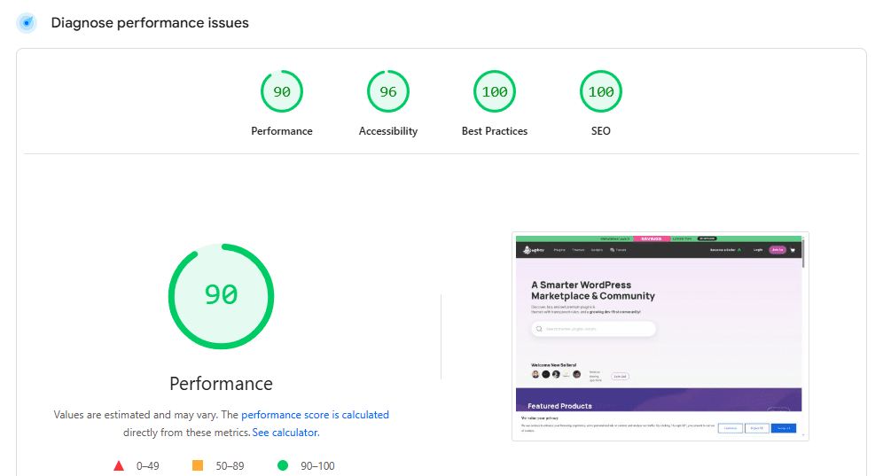
The page load speed was also increased, as we designed it to be more flexible and lightweight.
There are still things to be improved, but we are actively improving and working on the site, to make it better and better.
Ok, so what’s next?
If you’re a seller reading this, know that we’re pushing ourselves the same way we ask you to. If you’re a buyer, know that your trust and time matter, and the experience you get here should feel worthy of it.
If you’re sitting on a plugin or theme that needs a refresh, take this as your sign to do the work. Improve it. Polish it. Bring it up to the standard you want your name on. We did it for WPBay, now it’s your turn for your own work.
We’ll keep building. You keep building. Tha’s how WPBay stays true to what it stands for.
Thanks for being part of it!
Szabi